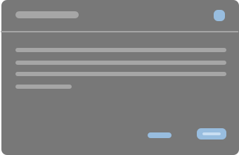
Develop with Fiori
Fundamentals.
Fiori Fundamentals is SCSS ready! Explore some functions and mixins to maintain consistency & quality of your SCSS.
EXPLORE COMPONENTS GETTING STARTEDCURRENT VERSION v1.5.4-rc.1
foundation.
Colors.
Colors bring designs to life. It is used in a meaningful way to express emotions and tone, and promotes a distinct and consistent look and feel throughout all application.
READ MORE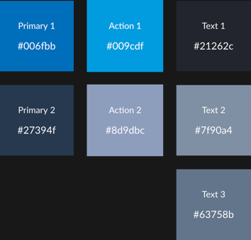
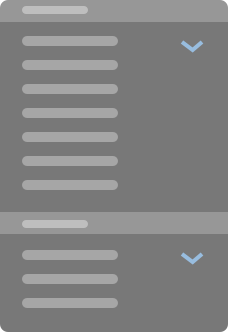
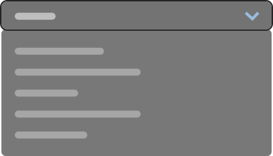
Grid.
Fiori Fundamentals uses responsive grid system that achieves flexible 12-column flow layout. It is used to create flexible layouts for various screen sizes and device types.
READ MORE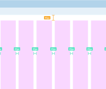
Spacing.
Spacing helps content to breathe as well as create hierarchy and depth. It ensures optimal readability and space efficiency, all heights and widths are calculated from a base unit or 4.
READ MORE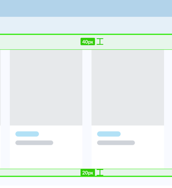
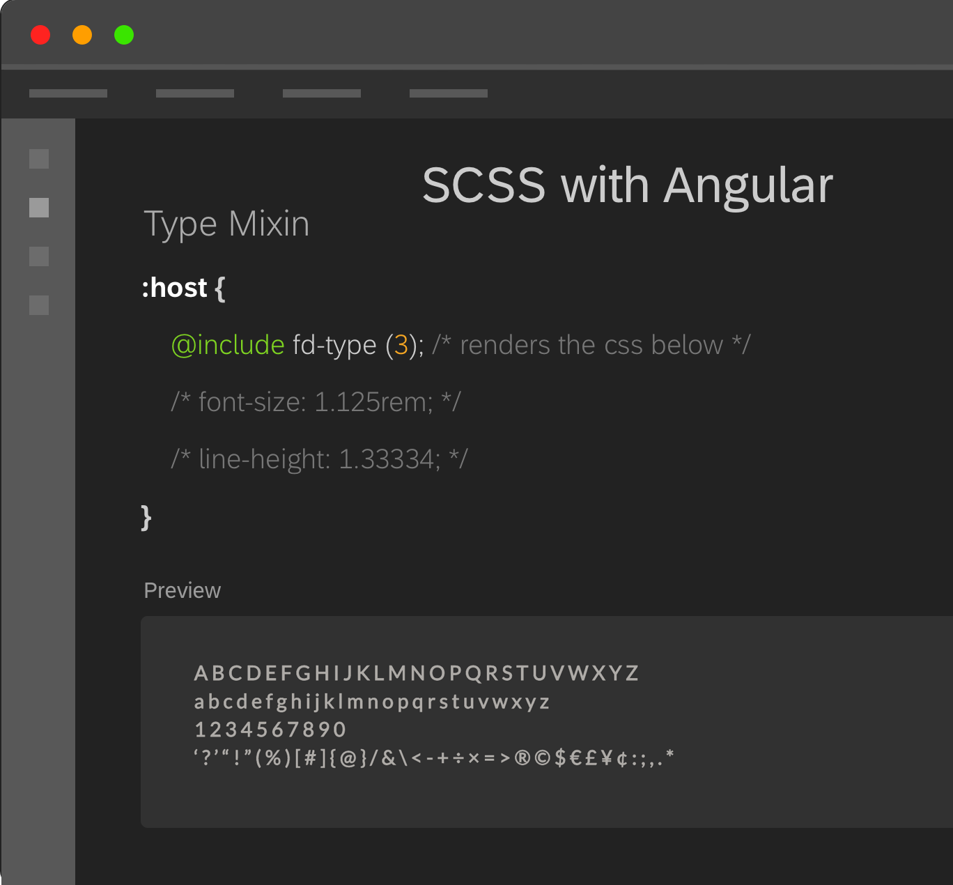
Type.
Fiori Fundamentals uses a set of sans-serif system fonts. They are timeless fonts ensures that the fresh, clean, and minimalist style. It works well across all browsers, devices, and platforms for customization to be easy.
READ MORE
resources.
The Fundamentals UI team is always making improvments to our Sketch UI kit. Keep track of updates.
Download UI Kitoffice hours.
Live monthly demos with Q&A.
Every month the SAP Fiori Fundamentals team hosts a live stream of a presentation covering anything from library updates, how-to's and demos. It's also an opportunity for us to engage with our users and answer pre-submitted questions or those that come in live.
LEARN MORENext Session.
Office Hours
TBD, February 2019